Bofferding
Logo Concept
2021
Client
Bofferding
Industry
Beverage & Brewery
Year
2021
Services
Brand Identity
Packaging Design
A conceptual redesign that modernises Luxembourg's most iconic beer brand while preserving the heritage elements that make it recognisable.
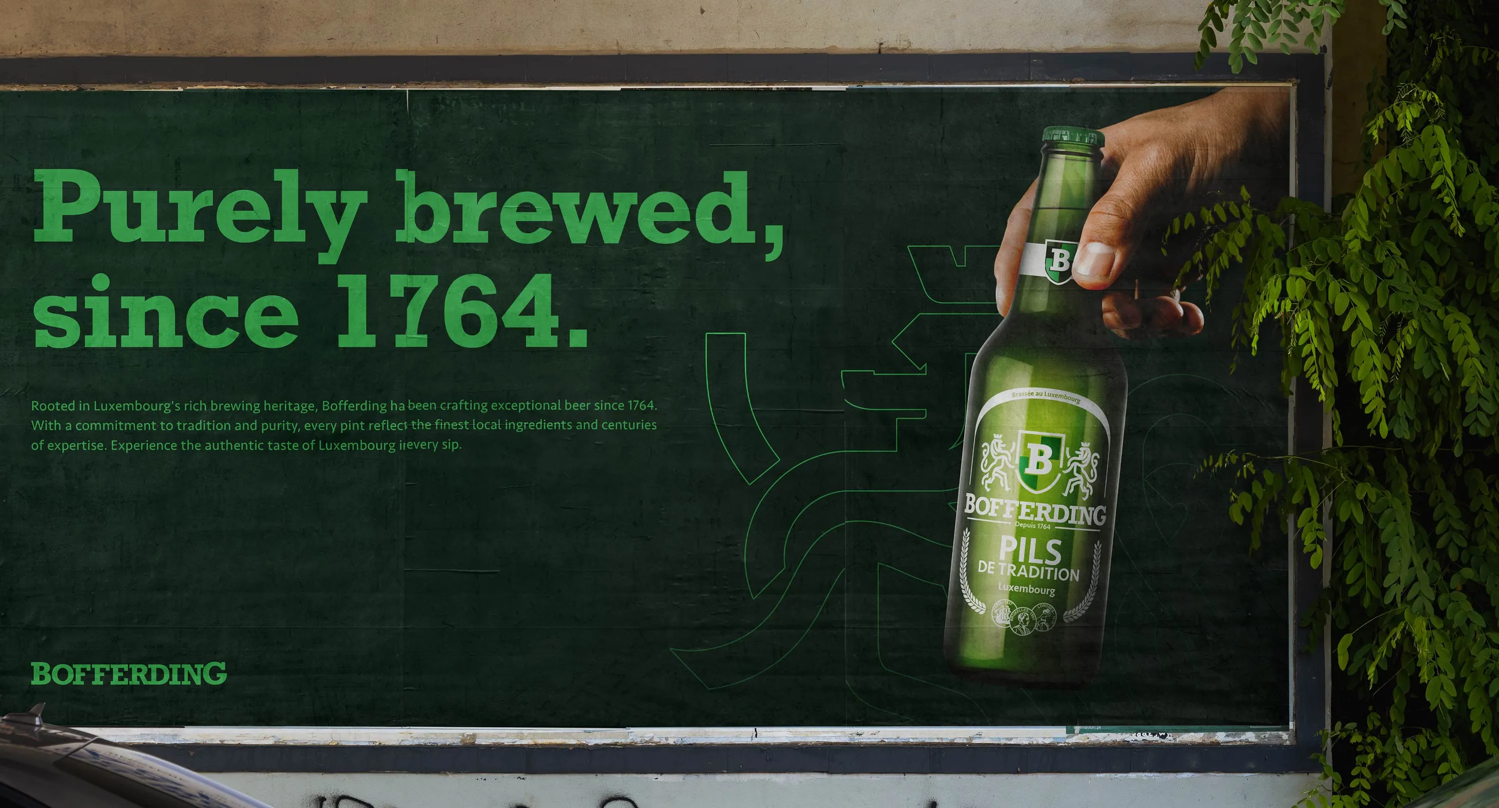
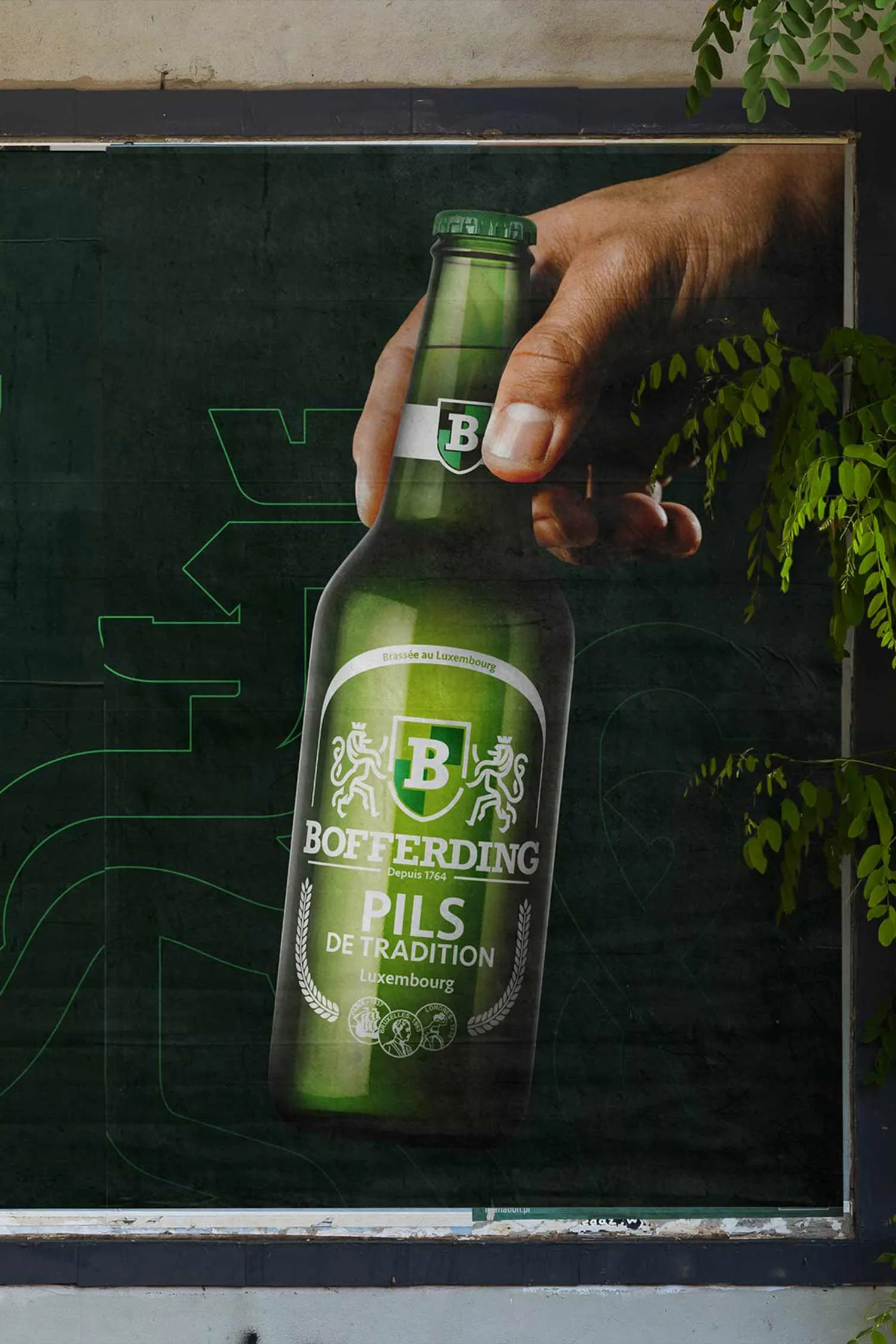
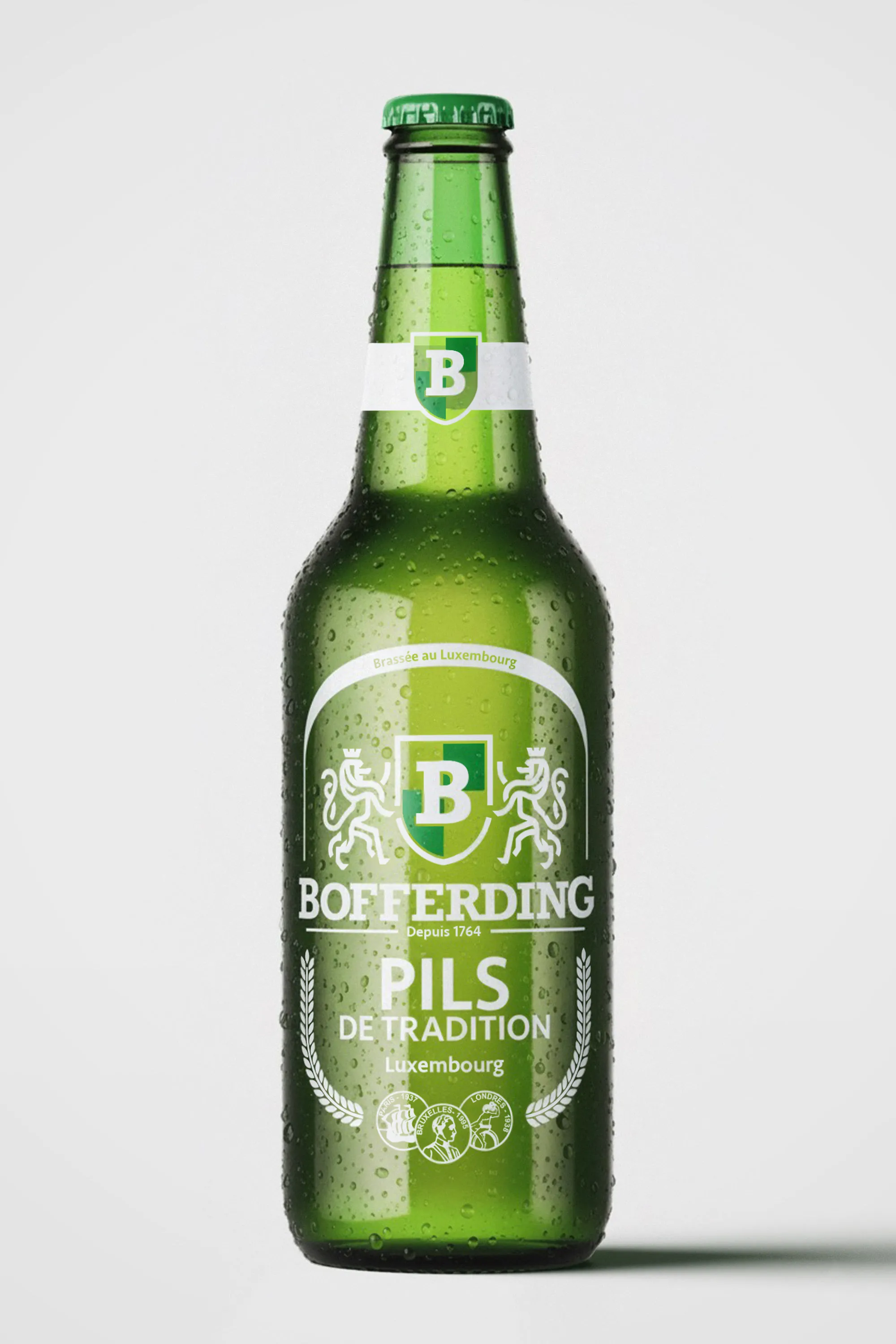
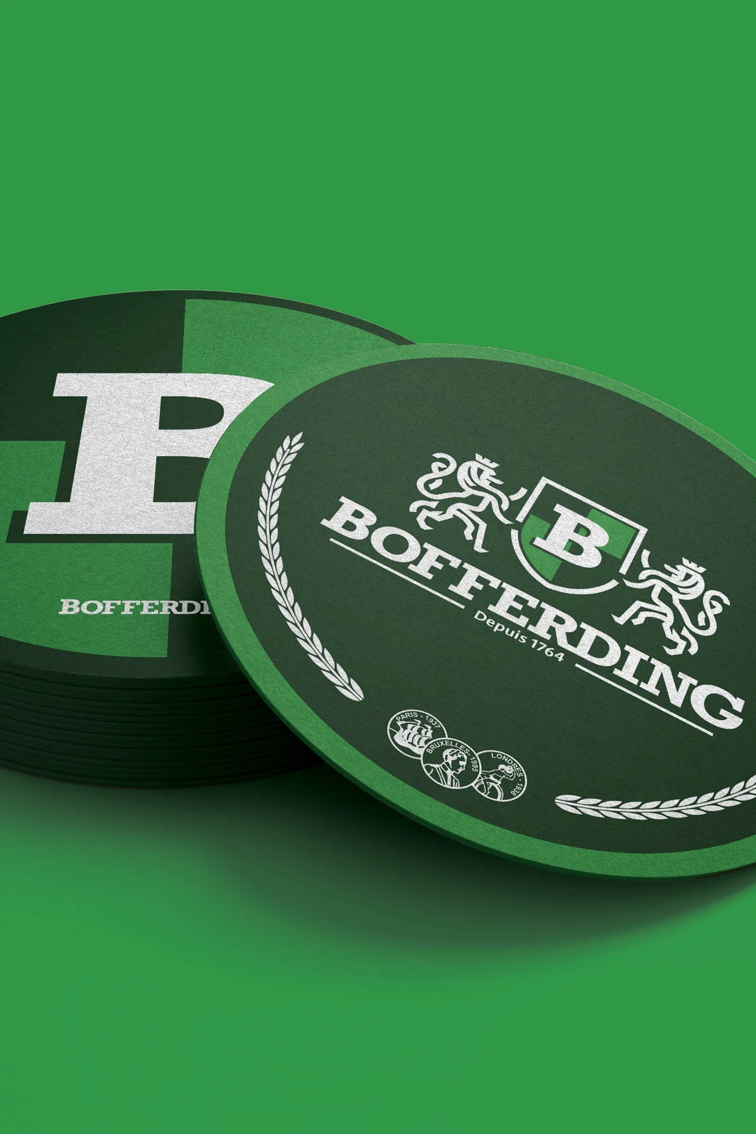
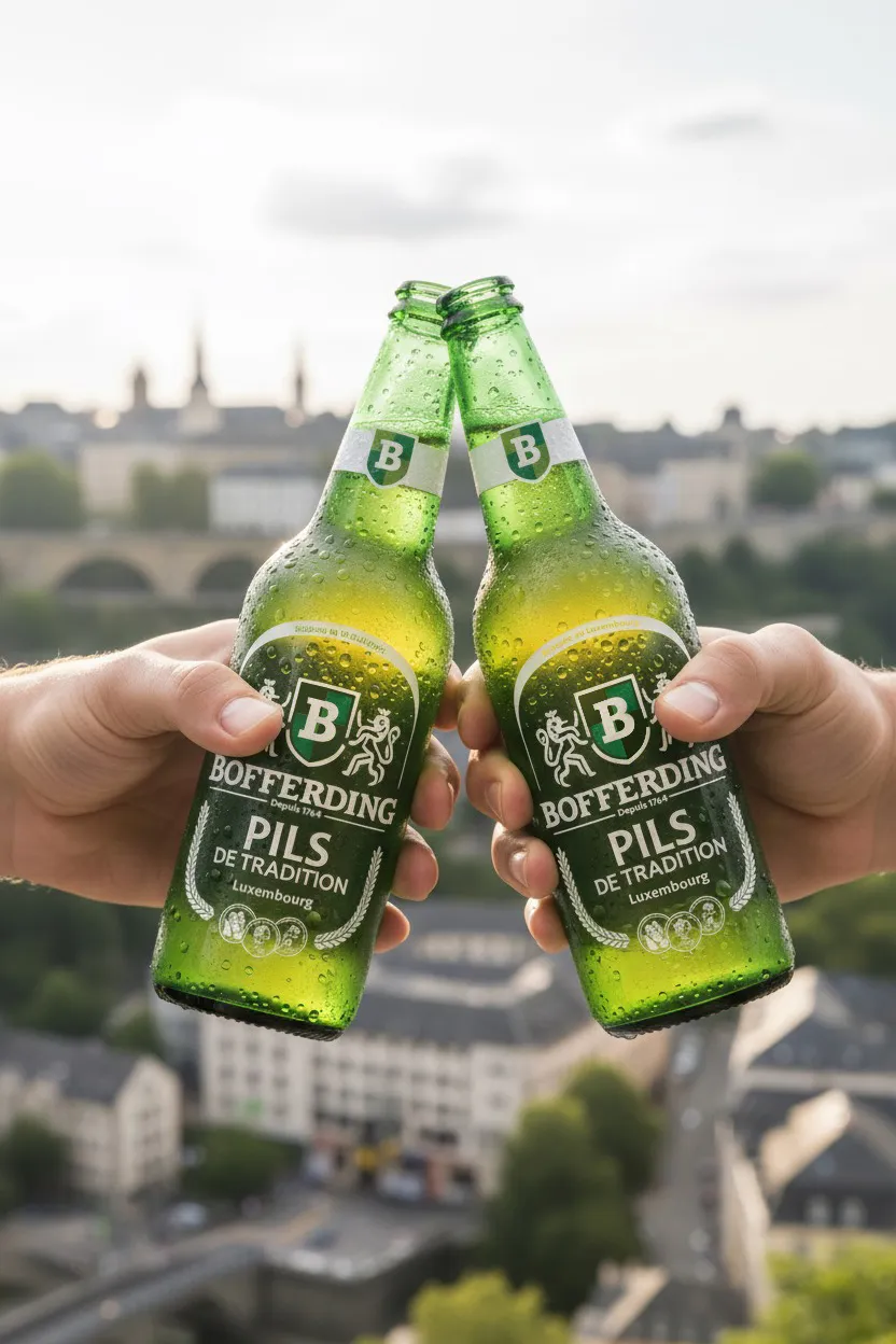
Bofferding is the flagship brand of Brasserie Nationale, Luxembourg's largest brewery. Brewed since 1764, it's the most popular beer in the country. This is a personal concept project, unrelated to the company. The original logo carries deep heritage value: a coat of arms, two lions, the initial B repeated four times, and the founding year. But these elements, designed for a different era, don't translate well to responsive digital formats. The challenge was to modernise the identity for today's applications without losing the symbolic weight that makes Bofferding recognisable. We simplified the iconic lions with clean lines and bold edges, reduced the emblem to display the initial once for clarity, and developed a suite of logo variations optimised for every format, from packaging to app icons. The result is a logo system that bridges 260 years of tradition with contemporary design requirements.
Have a Project in Mind?
Every project here started with a discovery call. Yours can too. 20 minutes, no commitment.